

A big feat is behind us – we made it! For months, our web team worked on a mammoth task for you and rebuilt our online shop. The main focus of the relaunch is uncompromising user-friendliness. It starts with a clear structure, extends to integrated features and significantly reduced loading times for the website, and does not end with the color-friendly design. And above all: Thanks to the fully responsive optimization, all desktop functions are now also available on your smartphones and tablets. We hope you enjoy it! Read more below! ?
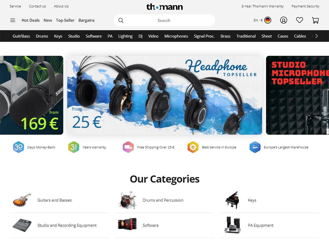
Redesign: Everything more user-friendly, clearer, cleaner and more appealing
We would like to thank you very much for your feedback and your input on our existing internet presence. We have incorporated your wishes, tips and suggestions, implemented them and of course also revised the points on which you have legitimately criticized. You see, we see that as positive criticism, something to work with. Here is just an excerpt of the numerous features that we have optimized for you and some of which have been newly integrated:
- Optimized for mobile devices according to the Google indexing “mobile first”
- Full range of features and content is now also available on mobile devices
- The entire website is now designed to be fully responsive (page elements reshuffle as the viewport grows or shrinks)
- Lean, clear and user-friendly redesign carried out
- Colored scheme changed to black and white and bright purple as the highlight color and
- Tidy menu structure for intuitive usability and much more…
New Homepage
thomann.de: Why the purple accent colour?
In fact, in the fast-moving web, colour is much more than a matter of taste. The choice of color has a decisive influence on legibility. In addition to the simple base, an accent colour should definitely not be missing. Why did we choose purple, of all colours? Unlike most other colors, purple provides sufficient contrast, is barrier-free and is not associated with a warning color. After all, you should feel comfortable while browsing our site. Only the color blue has similar properties, which we are already using in the logo. With all the reduced representation, we have allowed ourselves a little variety.

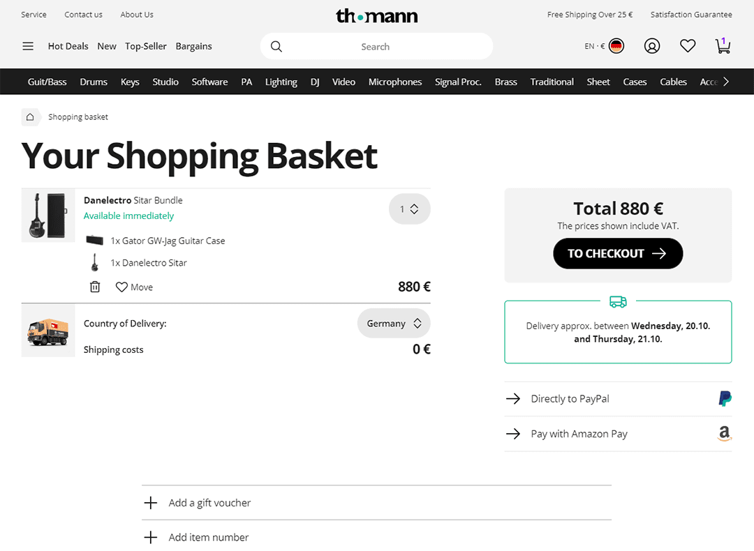
Your wishes implemented with new functional features
We have also implemented various functions in the mobile version as a reaction to your suggestions and requests. In the new version, you now have direct access to:
- the address book in the checkout
- writing reviews in the customer center
- the selection of packing stations when purchasing
- the compilation of our “Creative Bundles“
Now online and functional
And of course you can imagine how excited we are for your reactions. We put a lot of energy into the project and we are still investing in it. We are extremely pleased with positive feedback; We see negative reactions as an opportunity for improvement. Feel free to use the feedback button without hesitation or write to us in the comments below!
New shopping cart


Comments 16