








Thomann website: now responsive and with a new design

Our thomann website is all new: new design, new features and all the tools that you need – plus, it’s now mobile responsive!


A big feat is behind us – we made it! For months, our web team worked on a mammoth task for you and rebuilt our online shop. The main focus of the relaunch is uncompromising user-friendliness. It starts with a clear structure, extends to integrated features and significantly reduced loading times for the website, and does not end with the color-friendly design. And above all: Thanks to the fully responsive optimization, all desktop functions are now also available on your smartphones and tablets. We hope you enjoy it! Read more below! ?


Redesign: Everything more user-friendly, clearer, cleaner and more appealing

We would like to thank you very much for your feedback and your input on our existing internet presence. We have incorporated your wishes, tips and suggestions, implemented them and of course also revised the points on which you have legitimately criticized. You see, we see that as positive criticism, something to work with. Here is just an excerpt of the numerous features that we have optimized for you and some of which have been newly integrated:

  • Optimized for mobile devices according to the Google indexing “mobile first”
  • Full range of features and content is now also available on mobile devices
  • The entire website is now designed to be fully responsive (page elements reshuffle as the viewport grows or shrinks)
  • Lean, clear and user-friendly redesign carried out
  • Colored scheme changed to black and white and bright purple as the highlight color and
  • Tidy menu structure for intuitive usability and much more…

New Homepage
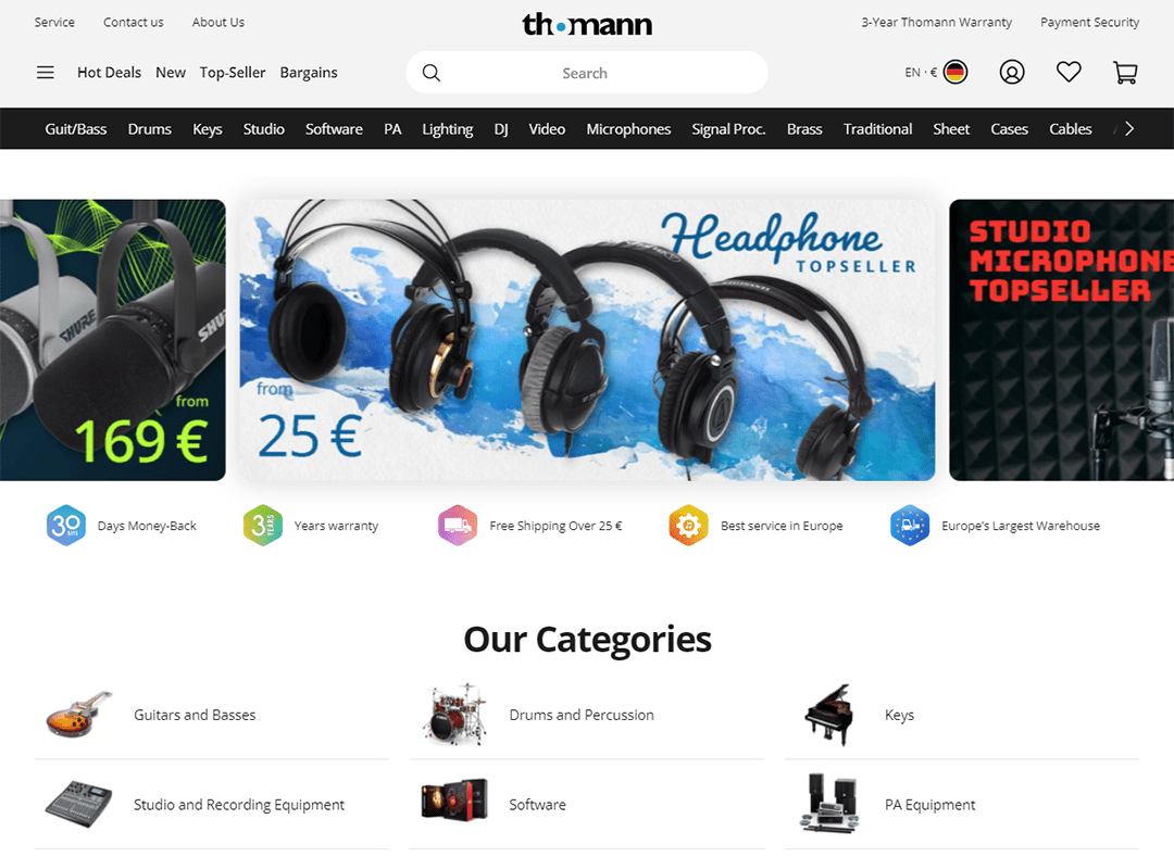
thomann.de: Why the purple accent colour?

In fact, in the fast-moving web, colour is much more than a matter of taste. The choice of color has a decisive influence on legibility. In addition to the simple base, an accent colour should definitely not be missing. Why did we choose purple, of all colours? Unlike most other colors, purple provides sufficient contrast, is barrier-free and is not associated with a warning color. After all, you should feel comfortable while browsing our site. Only the color blue has similar properties, which we are already using in the logo. With all the reduced representation, we have allowed ourselves a little variety.

Your wishes implemented with new functional features

We have also implemented various functions in the mobile version as a reaction to your suggestions and requests. In the new version, you now have direct access to:

  • the address book in the checkout
  • writing reviews in the customer center
  • the selection of packing stations when purchasing
  • the compilation of our “Creative Bundles
Unser Thomann-Webteam
Our Thomann web team. Editor’s note: The picture is a bit older and taken before the corona pandemic 😉


Now online and functional

And of course you can imagine how excited we are for your reactions. We put a lot of energy into the project and we are still investing in it. We are extremely pleased with positive feedback; We see negative reactions as an opportunity for improvement. Feel free to use the feedback button without hesitation or write to us in the comments below!

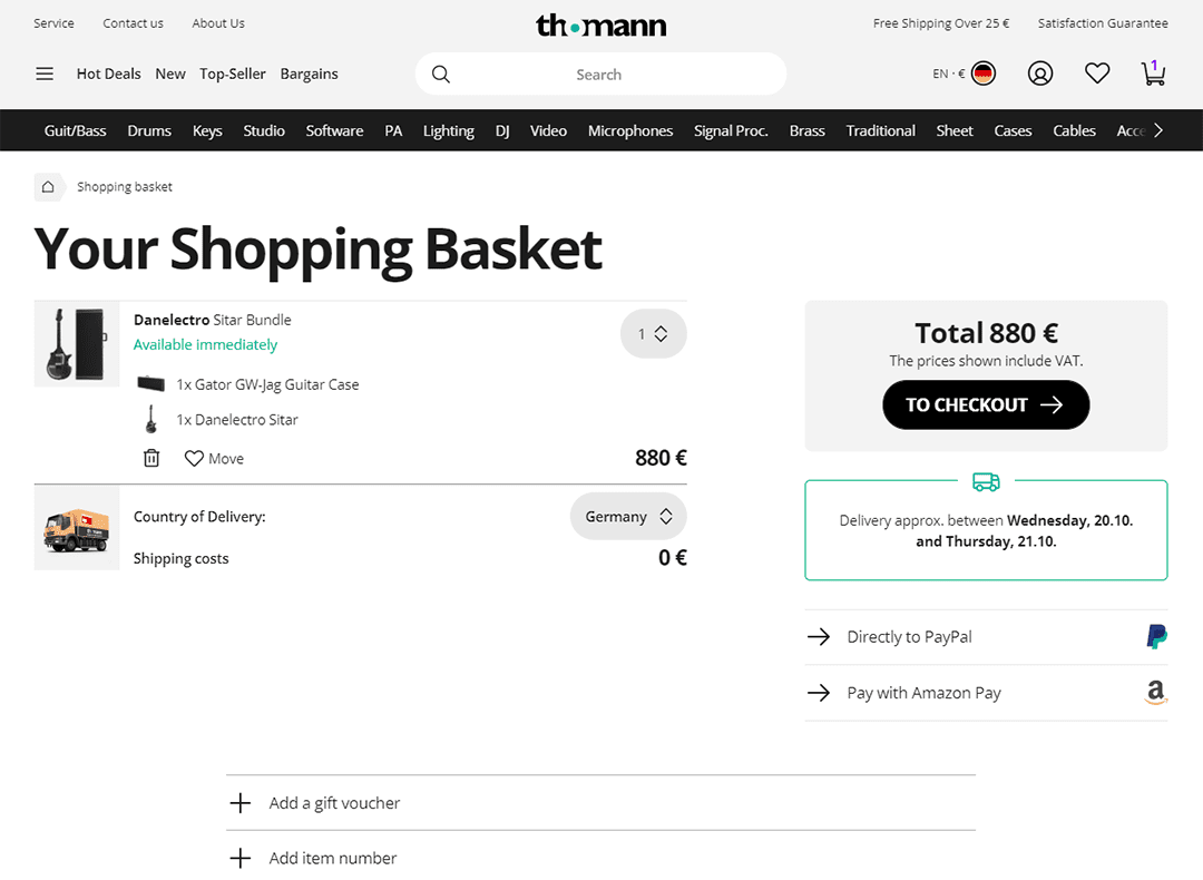
New shopping cart

Also interesting

Do you know our newsletter yet?

Subscribe to our newsletter and stay updated with the latest news, articles, and special offers!

Subscribe to newsletter

We respect your privacy and will never share your information with third parties.

Discover all our deals!

Special offers and promotions available in our shop

Comments 16

  1. Marian Fellinger says:
    I fully agree with what Luca wrote. It feels like a mobile website that hasn't been optimized for Desktop. Feels very bright and cold and a lot of buttons and headers are too big. Zooming out to 80% makes it somewhat okay again, but then the buttons that were okay before are now way too small. Most of all though, it now just feels like a cold place where everything is jumping at you.
  2. Agustus Simpson says:
    Hi when will my harmonica arrive in Scotland, customer no 16425684, Mr A Simpson, 77 douglasdale eastkilbride G741DE My new email, gstssmpsn8892@gmail.com Thanks mrA Simpson
  3. Michael O'Casey. says:
    Can I have my Thomann app back, please? So that it actually responds. Instead of totally blocking me out. I'm long time customer. I want to order now. I need the eqpt.
  4. P. says:
    If it were only usable without a Mouse. Search Dialogs can't be closed through Escape and so on. The design choices are a bit confusing... Perhaps try to use the site without a mouse, for one day...
  5. Super says:
    Good website and great update. As already mentioned, dark mode would be greatly appreciated :) Cheers!
  6. Cezar says:
    Hi! Congrats on the new website! As I am a senior web-designer, please accept some propositions for making it even better. Maybe you could adjust things for the desktop version? Everything is huge, especially titles, prices and buttons. I'm scared to even push such huge buttons :D it's like they are shouting at me... Also, on titles with fx-underlined-headline--underlined class, maybe add a little space between the title and the underline accent color, it's kinda hard to read. Regards!
  7. Bogdan Octav says:
    A dark mode would be greatly appreciated, though. On screen it's far too bright. Thanks!
  8. Luca says:
    Why the hell making it exclusively mobile friendly? What about those odd people that use ancient machines called computers? This new version feels horrible, gigantic buttons, everything is bright...I have a 32" ultrawide monitor and my eyes are bleeding and I feel like I'm in a kindergarten rather than a music shop. Did you just test the new website on smartphones? Jeez bring back the old one or make a dark mode, can't navigate it anymore :/
    1. Joe says:
      Thanks for your feedback Luca, we take all opinions into consideration. Having a dark mode is not a bad idea! //Joe
  9. Lubomir Velev says:
    Тhere is one negative so far though - missing info now for product year landing at Thomann, which gives a fresh impression when was its launch year!
    1. Joe says:
      Hi Lubomir, the info should be there at the bottom of the specs. It should have the month and the year that the product first arrived at Thomann. All the best, //Joe

Leave a Comment

Your email address will not be published. Required fields are marked *